It's hard to be human
PROJECT OVERVIEW
Life is messy, complicated, and exhausting, but coffee makes it a little easier. It’s Hard to Be Human isn’t just a coffee brand; it’s a daily ritual for those trying to navigate the chaos. Whether you're running late, overthinking life choices, or just trying to survive Monday, our coffee is here to keep you going.
NOTE: This is an unofficial conceptual project created solely for portfolio presentation.
All Starbucks trademarks and assets are owned by Starbucks Corporation.
MY ROLE
Solo Brand Designer
SCOPE
Branding, Print
TOOLS USED
Illustrator, Procreate, Photoshop, Adobe Firefly

THE LOGO

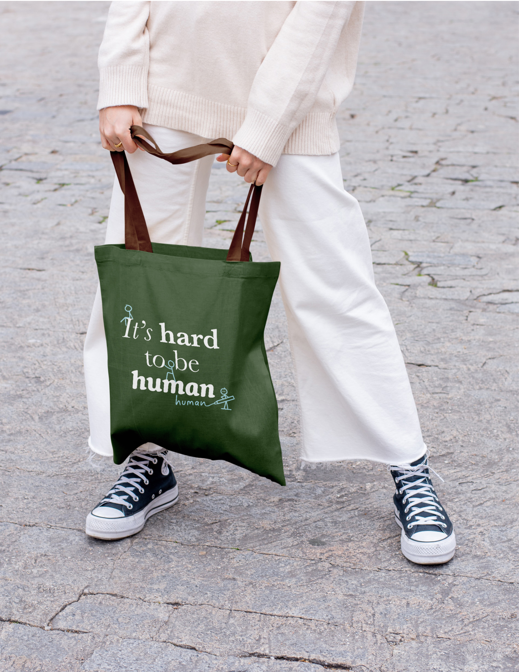
The "It's Hard to Be Human" logo captures the honest, relatable vibe of the brand. Playful stick figures and the mix of purple and green create a sense of whimsy and calm. The handwritten "human" adds a personal touch, emphasizing that life's imperfections are part of the journey, perfect for a coffee brand that feels like a comforting companion through everyday struggles.

ILLUSTRATIONS

The illustrations are a blend of whimsy and warmth, designed to uplift and inspire. From the 'Whimsical Encouragement Mural' to playful floral characters, every element reflects our belief that a little coffee and a lot of kindness can brighten the everyday. These visuals bring our brand's personality to life, infusing positivity into every cup.

oTHER works

CIRKUL

DAYTON SKYLINE

EXPEDIA

VITAL PAWS

WALMART

HARD TO BE HUMAN

OTHER WORKS